
Case study · City guide
Yese.gr
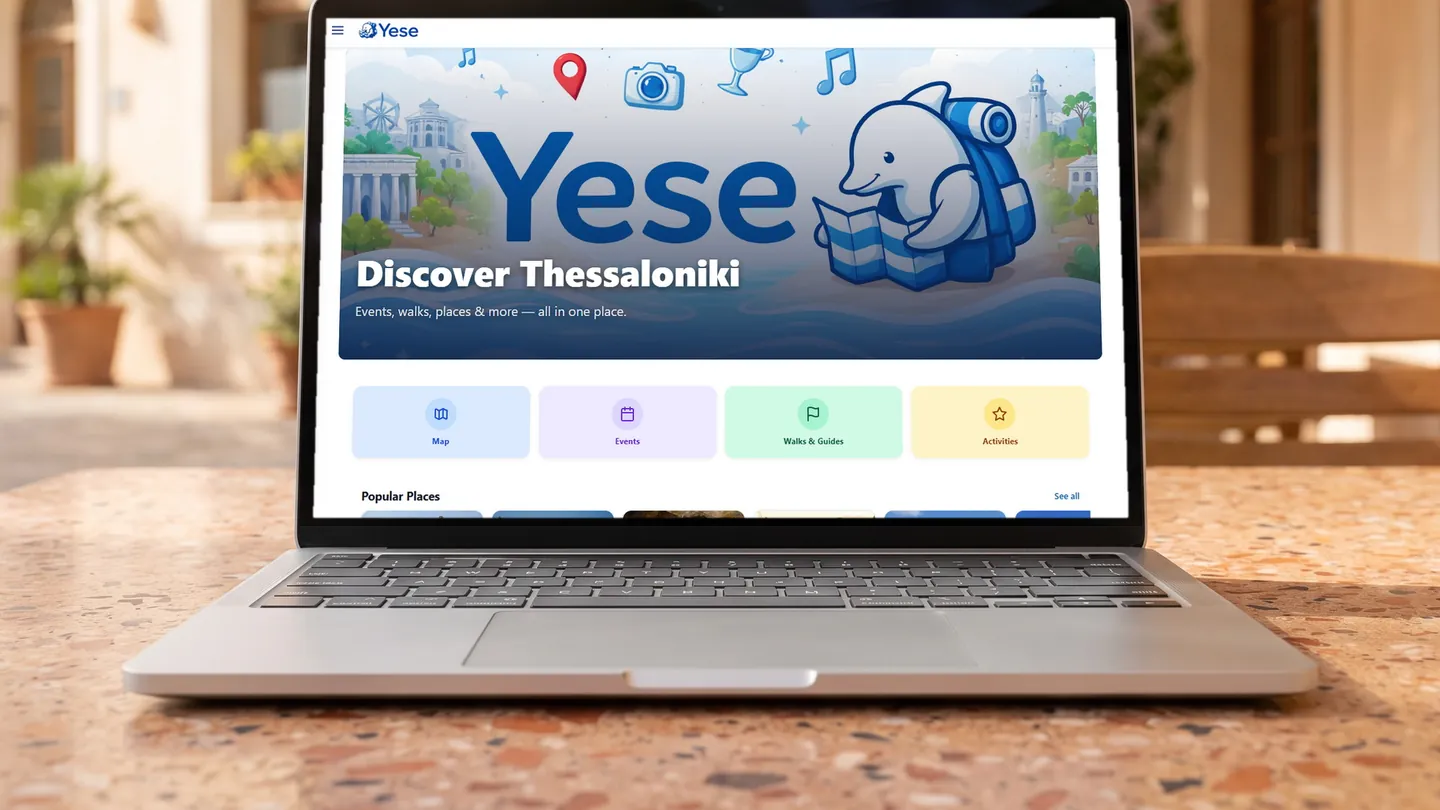
A guide to Thessaloniki built as a map rather than a list, with the places curated by category and the whole thing editable without a developer.
The problem
City guides are written as articles and used as maps. Someone standing on a street in Thessaloniki does not want a ranked list of forty things to do in the city — they want to know what is worth seeing near them, right now.
The gap between those two shapes is why most guides get opened once and never again. The content is fine; the interface answers a different question than the one the visitor is asking.
The goal
Put the whole guide on a map, filterable by the kind of thing you are looking for, on a phone, in the language you read. And make it maintainable, because a city guide that is not updated stops being a guide within a season.
What I built
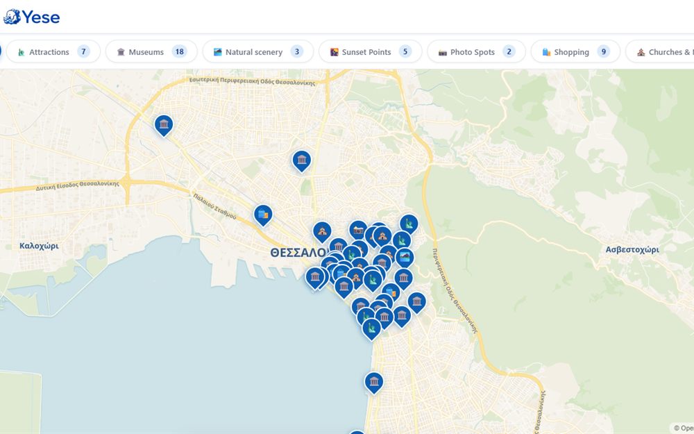
- A live map interface as the primary view, with every curated place pinned on it.
- Category filters — attractions, museums, natural scenery, sunset points, photo spots, shopping, churches — each with its own count, so the map can be narrowed to one intent at a time.
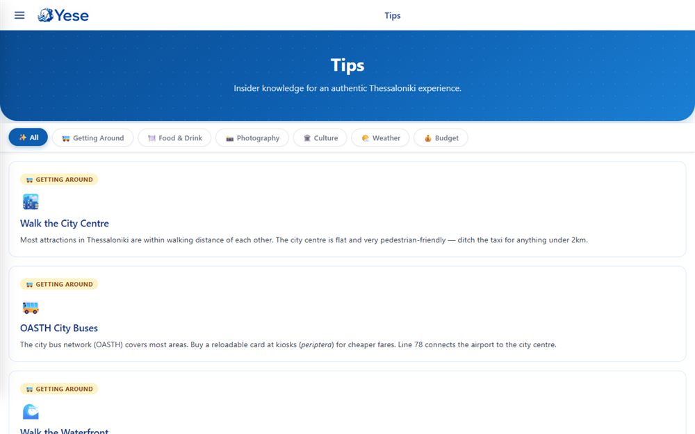
- A tips section for the things a map cannot express: getting around, food and drink, culture, weather, budget.
- Multi-language content, since a city guide with only one language serves half its audience.
- An admin panel for managing locations, events and guides.
- Firebase and Firestore underneath, with live updates rather than a rebuild per change.
Technical decisions
The map is the home screen, not a feature
Most guides put a map behind a tab, which means it is only reached by people who already know what they want. Leading with it changes the first question from "what should I read" to "what is around here", which is the question a visitor actually has.
Cost: a map-first interface is heavier on a phone and worse for search engines than a page of text. The tips section exists partly to give the site content that can be indexed and read.
An admin panel, because content decay is the real failure mode
A guide's enemy is not a bug, it is a place that closed last winter. Locations, events and guides are data managed through an admin panel, so keeping the content true does not require a deployment.
Cost: an admin panel is a second product with its own access control and its own maintenance, built for an audience of very few people.
Categories with counts, not a search box
A visitor to a new city does not know what to search for — they do not know the name of the church, or that the city has a specific sunset spot. Browsable categories with visible counts let the guide suggest, which is what a guide is for.
Cost: categories have to be curated and kept balanced. A category with two entries makes the whole guide look thin.
Where it stands
Live at yese.gr, covering Thessaloniki.
It sits between the client work and the products on this site: it was built like a product, with a data model and an admin surface, for a problem that a brochure site could not have solved.
Have a project in mind?
I take on client websites, web apps, and product builds across Cyprus and Greece.
Start a conversation